


NVV and Yatta expand digital ticket options in the NVV app
21 May 2026
HiDPI in Eclipse: A deep intervention with lasting impact
by Andreas Koch
|
7 April 2026
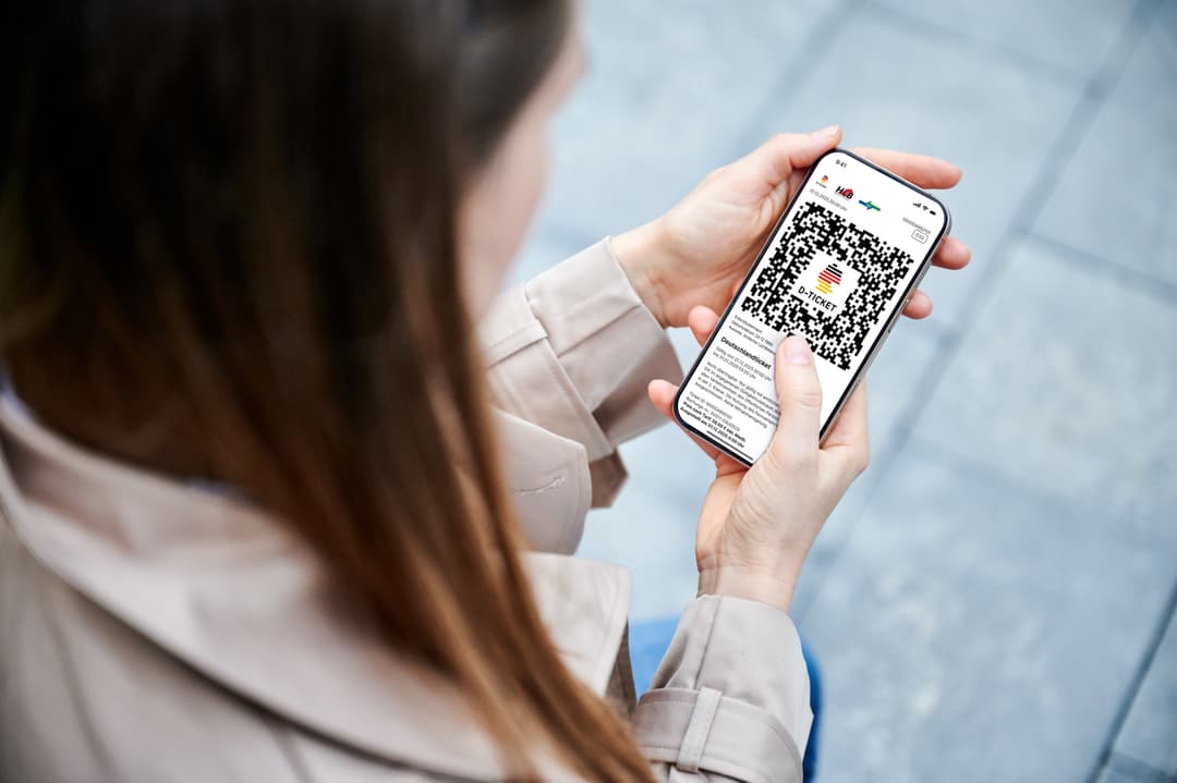
One click to the digital Deutschlandticket
30 November 2025


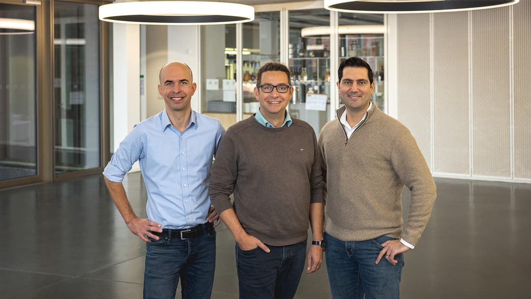
Making waves and moving forward – Introducing new roles and welcoming new teammates
Imagine the scene: A rider suits up, straps on their water skis, and gazes out across uncharted waters. Suddenly they’re off, pulled forward at exhilarating speed as they carve ...
by Rupert Burnham
|
6 October 2025

From digital tickets to a connected region: How user-friendly mobility benefits people and the economy
9 September 2025

Behind the scenes of development: Monitor-specific UI scaling for Eclipse under Windows
26 March 2025

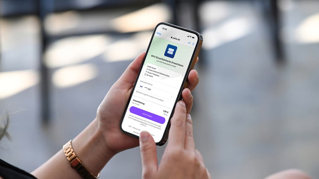
NVV launches new digital ticketing system based on Yatta Platform
Not long ago, it took three clicks to buy a public transport ticket in the NVV mobile app—and at least another 10 and numerous entries to register an account. This could easily ...
by Chris Stewart
|
23 January 2025

Yatta & NVV: How a company from Kassel helps make ticket purchasing smarter
21 January 2025
NVV has redesigned digital ticket sales in their mobile app—and switched to Yatta Checkout
11 December 2024
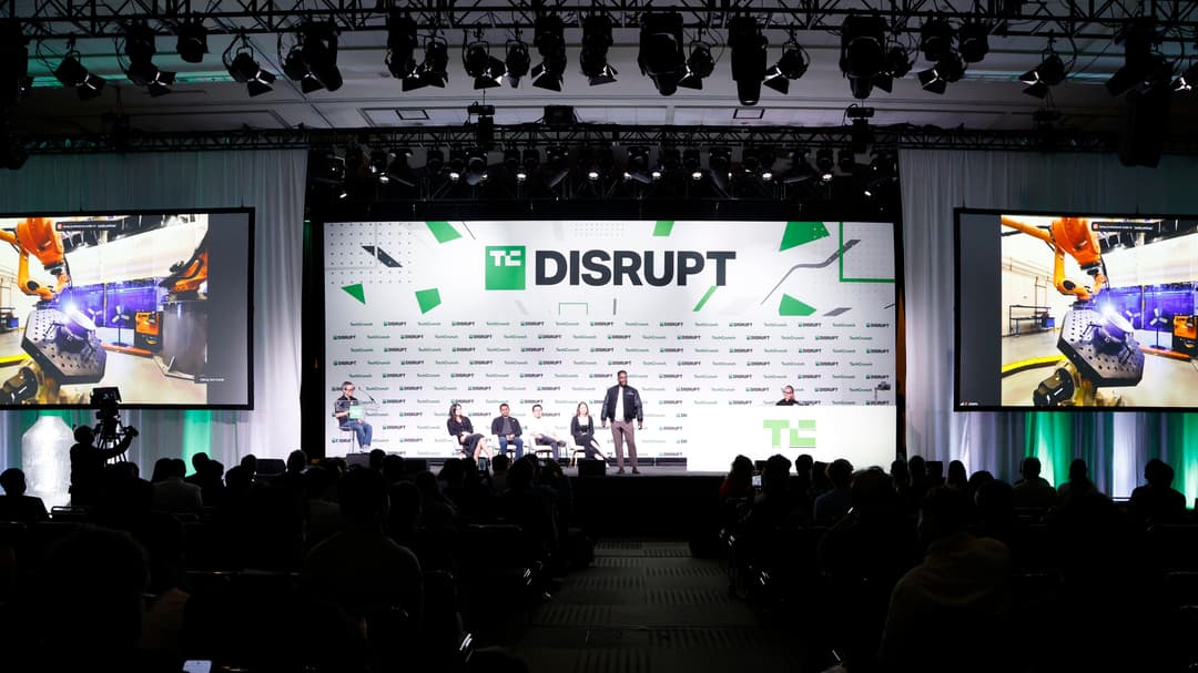
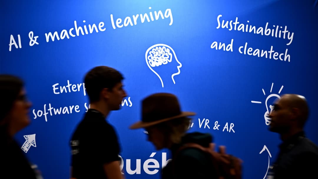
TechCrunch Disrupt 2024 highlights: The latest trends from San Francisco’s annual tech conference
by Rupert Burnham
|
11 November 2024

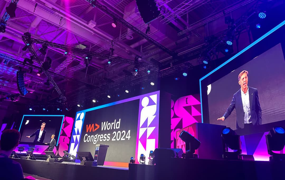
WeAreDevelopers World Congress 2024 highlights: News and trends from Berlin's biggest developer conference
by Christian Kemper
|
28 July 2024
Our highlights from Collision 2024: The latest conference news from North America about AI, startups
by Chris Stewart
|
25 June 2024

How companies can close the personnel gap and attract IT specialists
11 March 2024

Why to be a Techno-Optimist
by Chris Stewart
|
22 February 2024
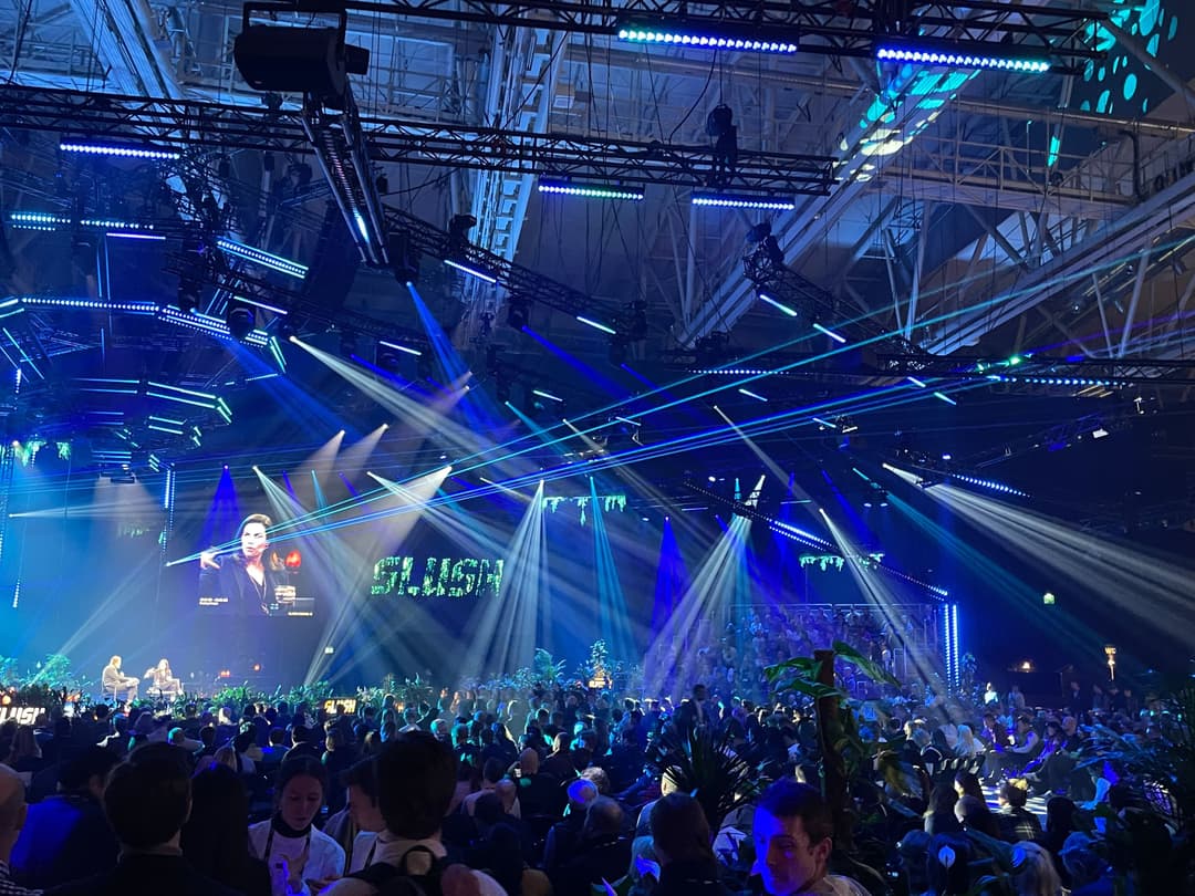
Our highlights from the Slush 2023 conference: The tech, the trends, the takeaways
7 December 2023

Improving the balance between software quality and development efficiency with AI
by Marie-Theres Wieme
|
6 November 2023